CASE STUDY // TECK RESOURCES
Graphic Standards Manual, Positioning, & Applications
CHALLENGE
This was a semester long project completed in my final year of the Graphic Design for Marketing program. Being tasked with rebranding and repositioning a corporate Canadian company, I selected Teck Resources. I felt that there was an opportunity to realign how Teck Resources is viewed by its stakeholders, the communities they operate in, as well as improve the perception around mining.
Through my research, I learned that one of the challenges facing Teck is the stigma around mining and resource development. Often viewed in a negative light, mining is not typically thought as being sustainable or environmentally friendly. Rather seen as 'destructive' or 'dirty'. Tackling this perception was challenging but valuable to do so, as it is important to get the benefits of mining and mineral retrieval out there. Many are unaware of how much they unknowingly benefit from it.
STRATEGY
My strategy for realigning Teck was to define a clearer indicator of who Teck is and what they stand for. To accomplish this, the tone of voice and brand characteristics needed to be established. With this step being taken, it had to be evident in all of the touch points and interactions, Teck Resources has with their stakeholders. The new brand strategy and visual identity needed to effectively portray the ethos of Teck Resources while still appealing to its stakeholders. The strategy focuses on highlighting and being more upfront with Teck's intentions and beliefs to their target audience. It was crucial to develop a look that would both be understandable to the stakeholders as well as start to break down the preconceived ideas around mining.
SOLUTION
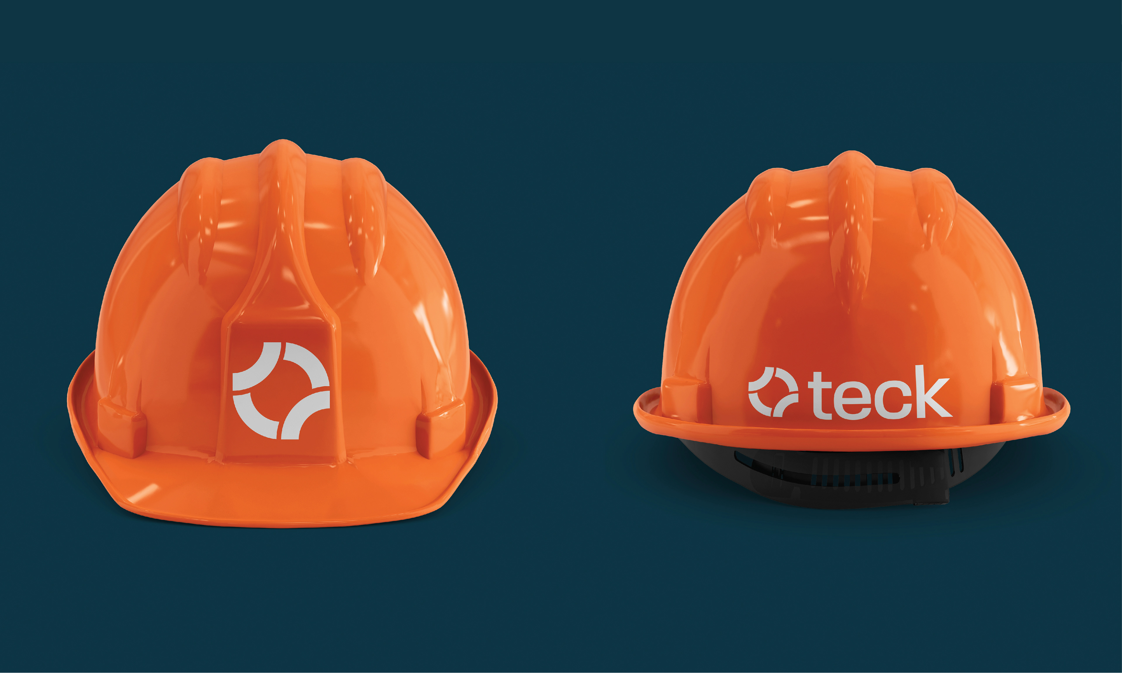
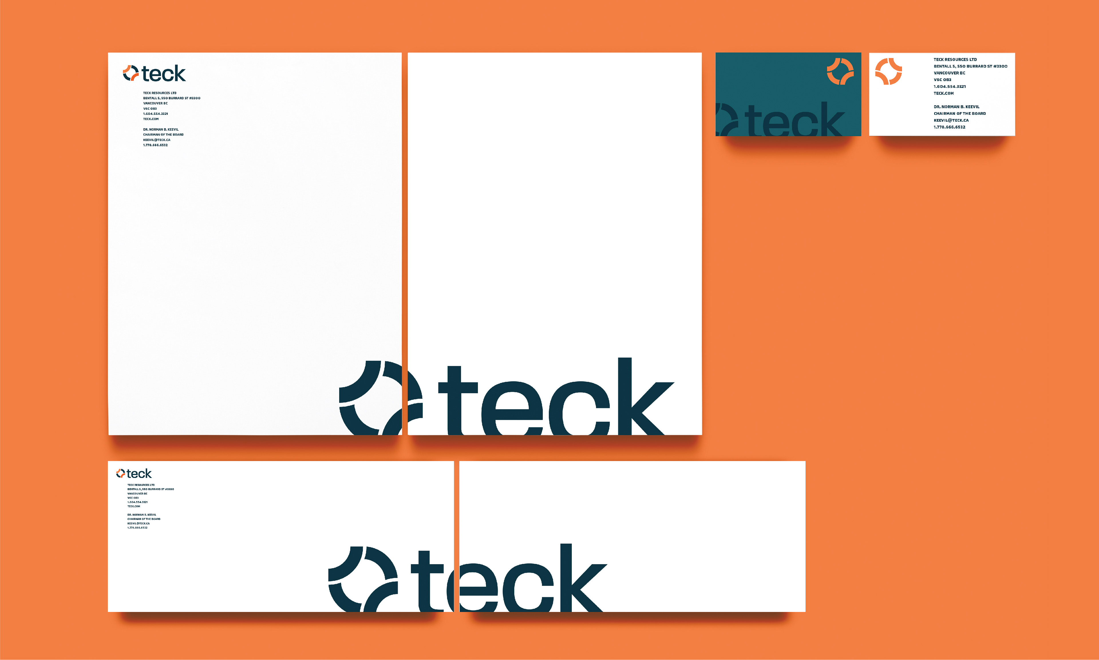
In order to infuse the newly developed tone of voice and point of view of Teck I needed to start where first interactions often occur - the wordmark. I discovered in my competitive landscape that Teck's current logo mark is more refined in comparison to other companies in its field. However, they still lacked a clear distinction of who they are and what they stand for. I developed a logomark built on showcase Teck's four main resources; Steelmaking Coal, Copper, Zinc, and Energy. The mark also pays homage to the old head lamps used to guide miners in the dark. The portions facing outwards symbolizes Teck's dedication to giving back to the communities they operate in and their efforts in ensure the best sustainability actions are taken. The inward facing portions represent the act of mining and mineral retrieval.
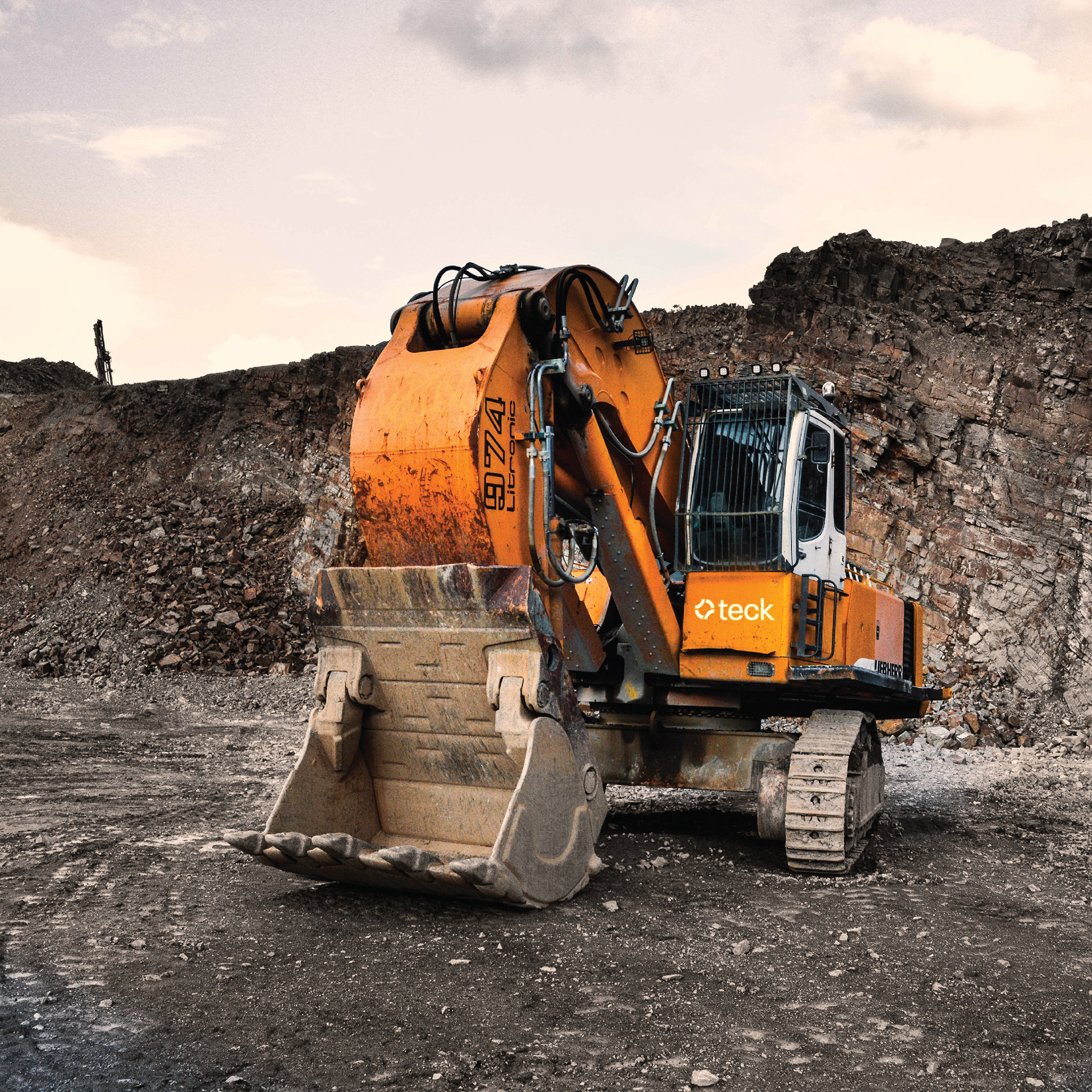
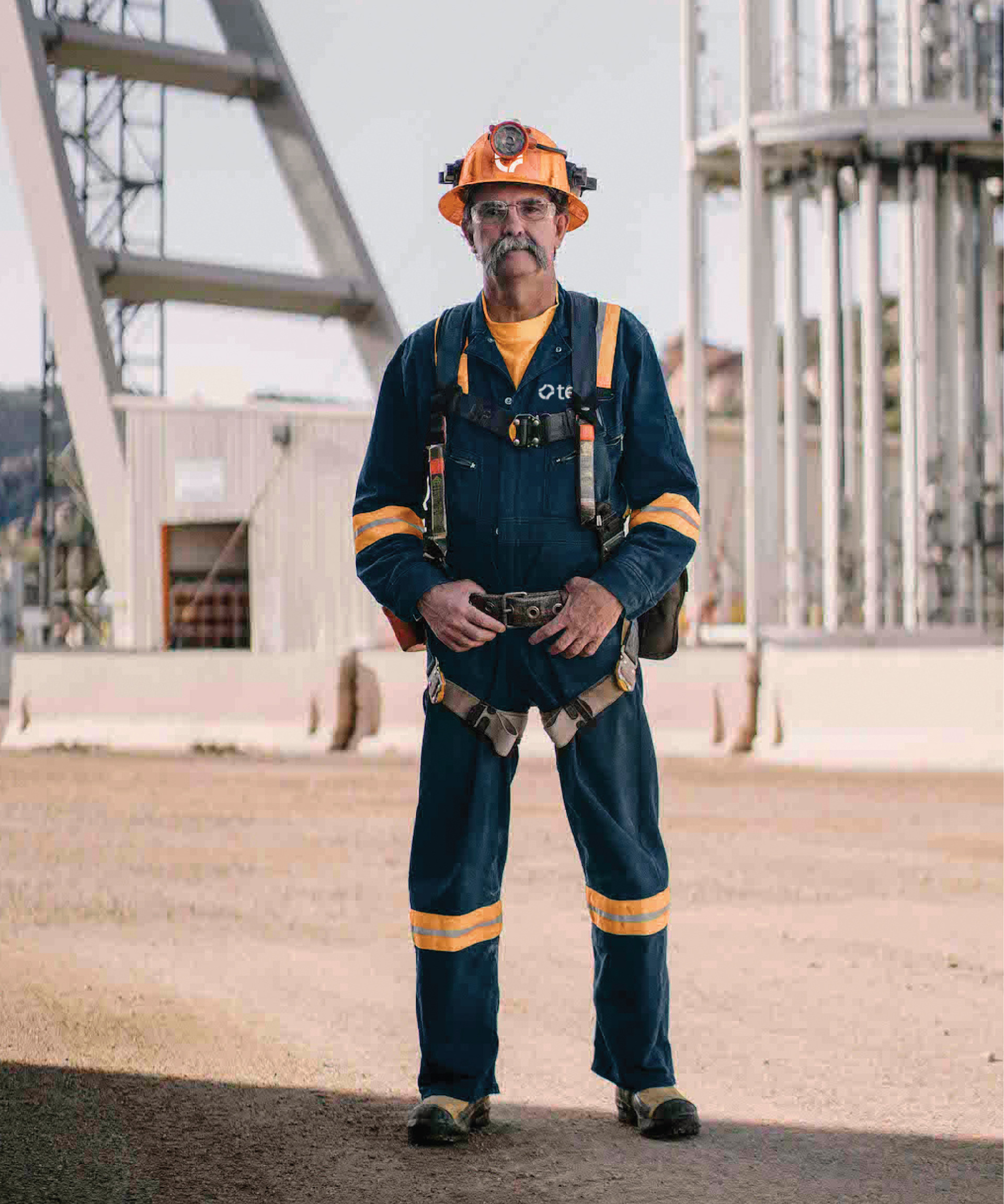
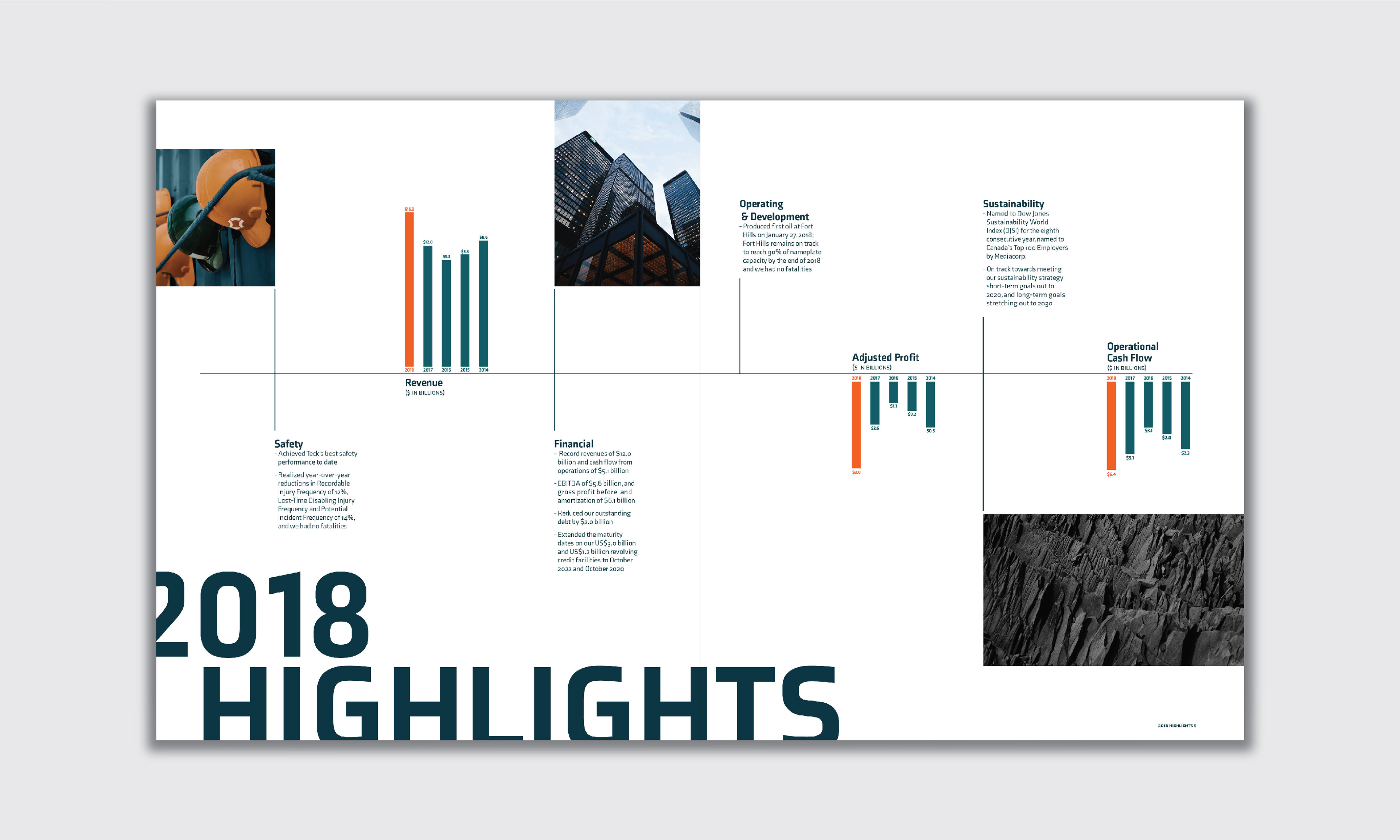
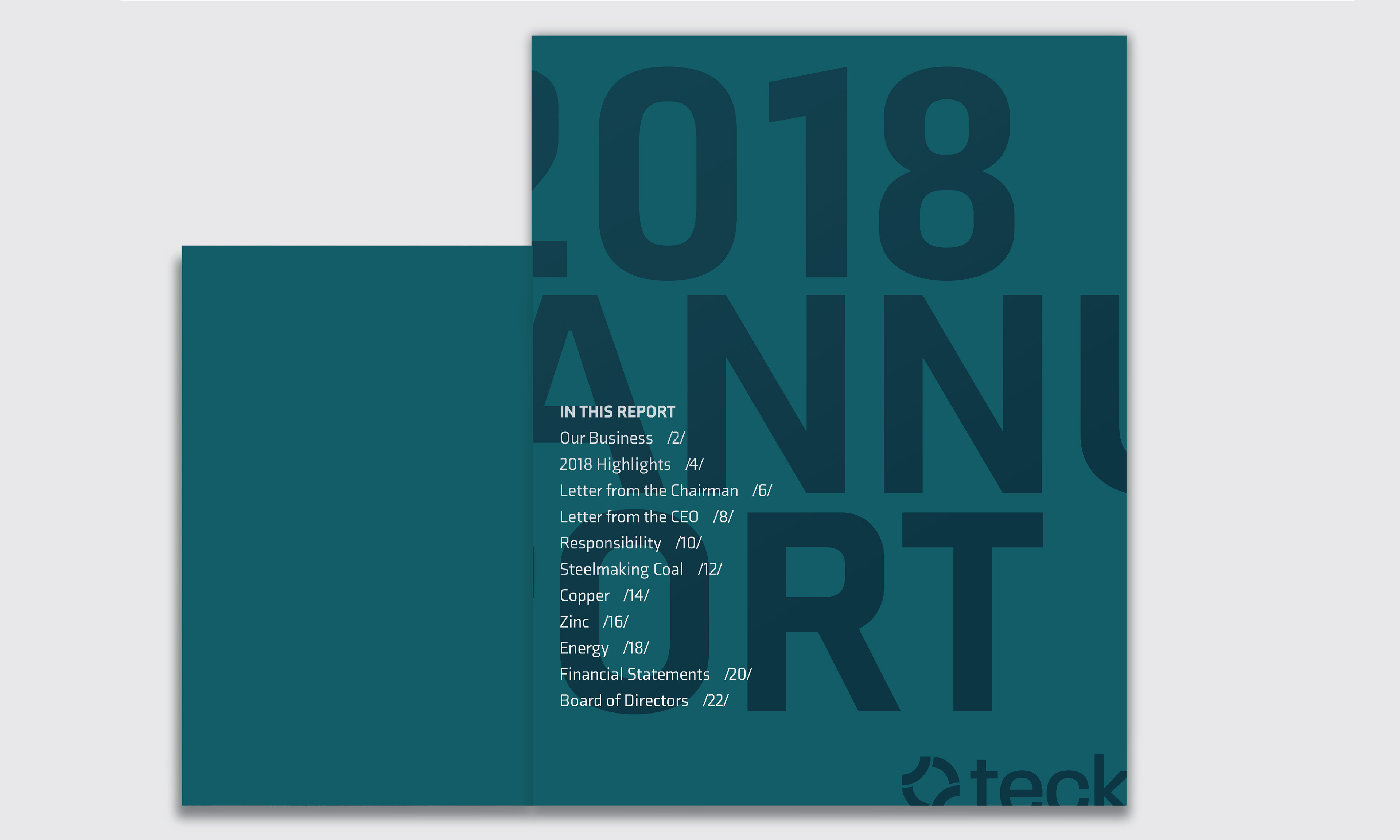
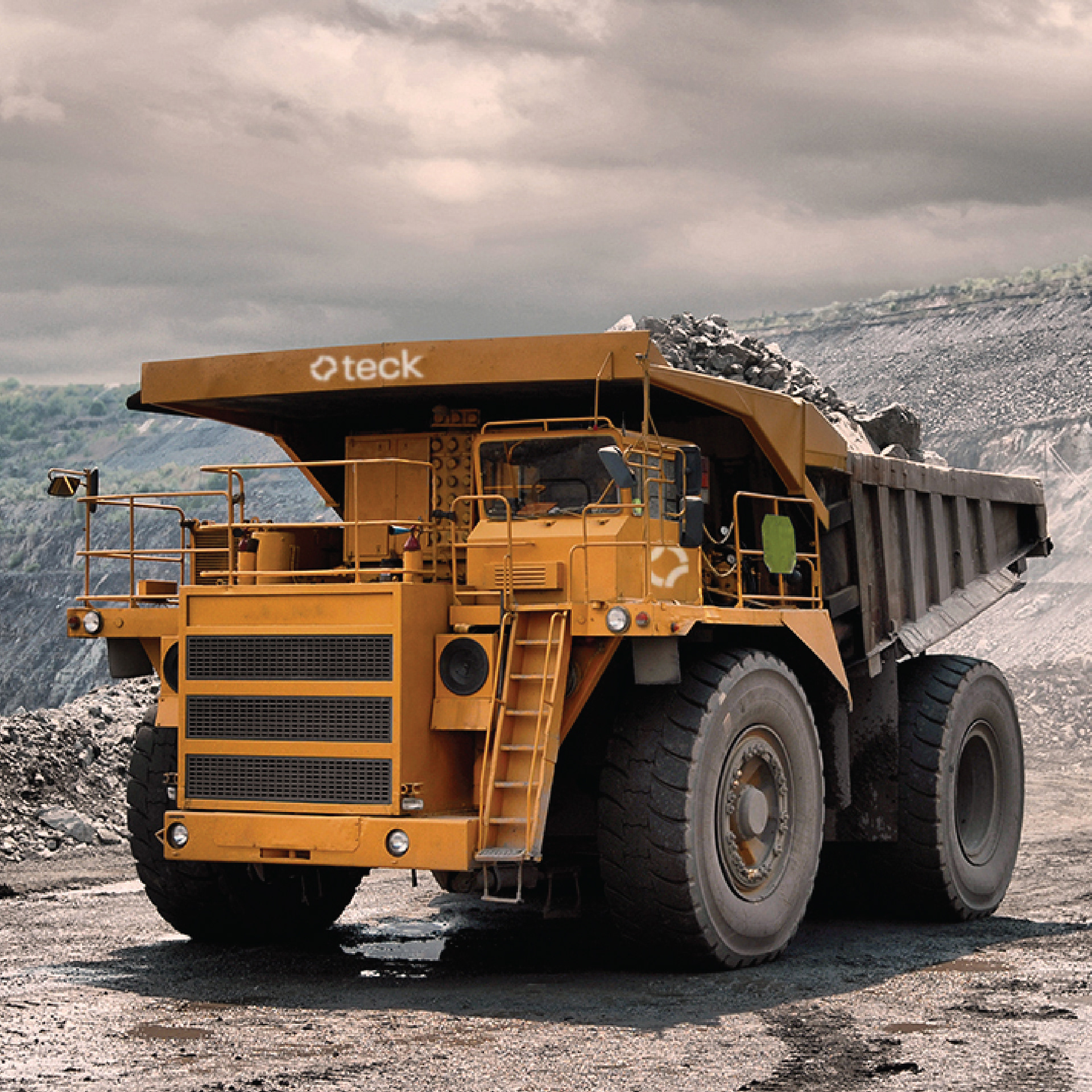
Building on this I turned to the imagery to support the new identity. Changing the general consensus on mining was important and often times the only interaction one has with mining is through what they see in photos. Rather than using in-action shots typically seen within the industry, I curated images that showed a more visually appealing side.
FINAL THOUGHTS
Going into this project I had a lot of preconceived, and mostly unsubstantiated views on mining and mineral retrieval. After digging deeper, I developed a better understanding of the industry and came to realize some of the benefits mining has. I feel that changing the way mining is perceived, starts from the companies themselves. Having companies shift the way they present themselves by becoming more transparent and being more upfront with their company values, will all around change the perception.

